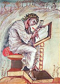
One of the earliest examples of the author’s image is the Evangelist portrait. These portraits were glorious full page illuminations of Matthew, Mark, Luke and John that appeared in the frontispiece of Medieval Bibles.
Since then, the author’s image has been reduced from a full-page color illustration in the front of the book to a small black and white photo exiled to the back. But the purpose remains the same—to allow the reader to picture the person who wrote the words on the page.
 In the Evangelists’ case, it was to confer saintly grandeur. For modern-day authors, as novelist Richard Ford (pictured to the right in a photo by Marion Ettlinger) once described it, the function of the author’s photo is as:
“A porthole window on the back of a paperback, which the author peers through and says, ‘Hi.’”
But what about when your editor tells you that she needs an author’s photo of you? How will you say, “Hi”?
First of all, you want to appear intelligent. With some gravitas. You want to seem attractive and interesting. But not pretentious or as if you are trying too hard. You want to be taken seriously, but you don’t want to come across as dull.
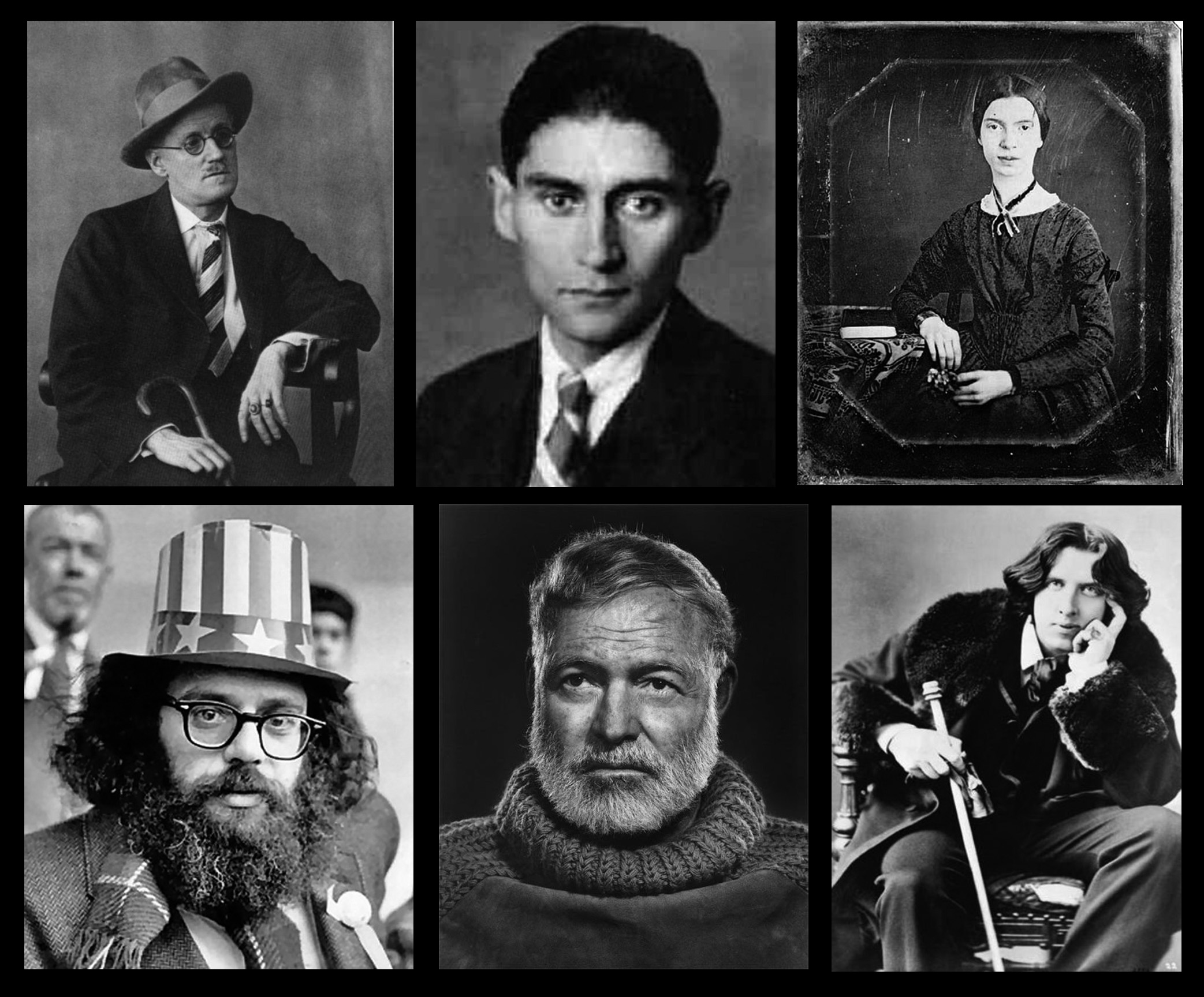
There are many pitfalls, such as some of these hilarious examples of awful authors’ photos. Of course, the fantasy is to have the photo on the book jacket look more or less like one of the iconic images of authors pictured below.

Go here to read Part 2 about our process
