In the beginning, an aspiring author’s book is just a bunch of files in a bunch of folders on his or her hard drive. But at some point, if you are lucky enough, like us, to find a publisher, your book will become printed matter, a physical object—and it will need to have a cover.
Chip Kidd, brilliant book cover designer, author and editor, says of the book cover designer’s role:
“We bring stories to the public. And stories can be anything. But they all have one thing in common. They all need a face to give you a first impression of what you are about to get into.”
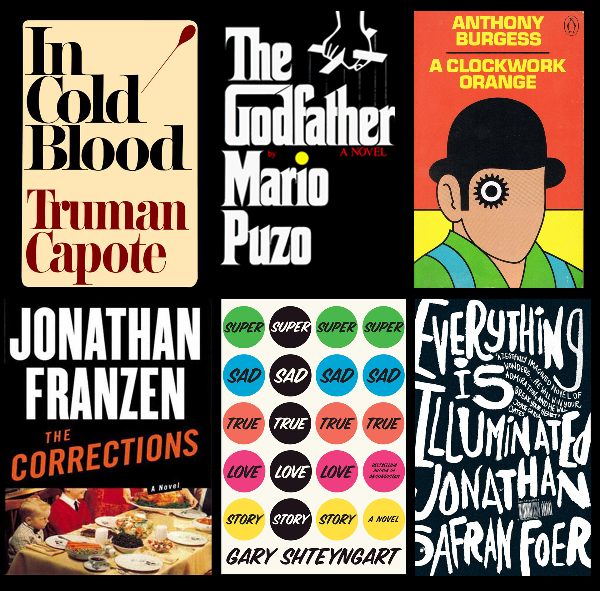
A cover for your book like any of these (above) would be a dream come true—a “face” so memorable and appealing it will be seared into the public consciousness for decades. But really, what are the chances of that?
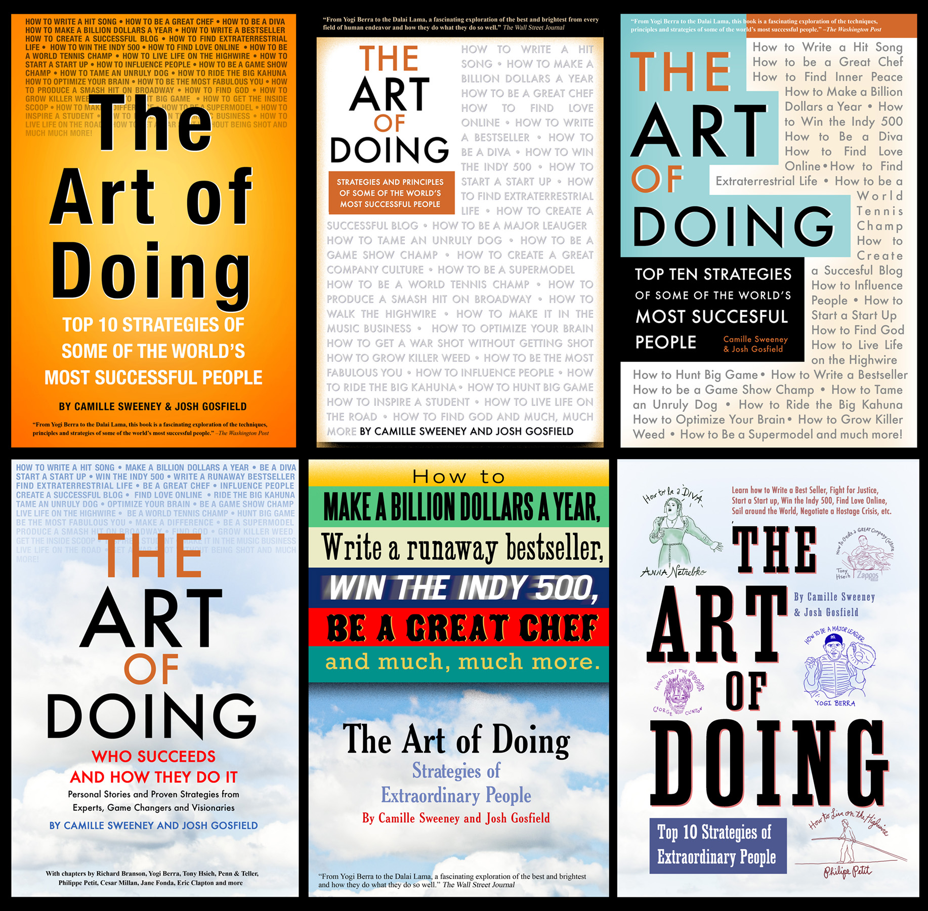
So naturally, Josh, (a former designer by trade) created not one, but ten possible book covers (below) to get a feel for what people may or may not like. We sent the covers out to our brain trust of family, friends and allies. The more literate liked the design-y covers. Those who wanted us to go more mass market liked the simpler, bolder (and okay, cheesier) covers. Creating the great cover would be harder than we thought. No one cover pleased everybody, including ourselves.
Then we sent all of these possible covers to the publisher, which they graciously accepted and apparently ignored. You may be the author of your book but that book will be assigned a designer and that designer will come up with cover concepts that will be shown around the publishing house to the editors and marketing people until a design is agreed on, at which point it will be shown to you. It’s as if you’ve been set up in an arranged marriage. What you will see when you lift the veil? Your biggest nightmare: What if the cover is ugly?!

One day the email arrived from our editor:
“Attached you’ll find the proposed cover for THE ART OF DOING. I’m pretty excited about it. I think it does an excellent job of bringing together a complex set of elements and conveying what the book is while being visually arresting.”

Opening the email attachment was like lifting the veil. IT WASN’T UGLY! We liked a lot of the design elements. The arrows conveyed the sense that the book was about process and gave the book an appropriate how-to-ish sort of feel. The dialog balloons communicated the sense that a reader would hear from these high achieving individuals in their own words. But was the cover too busy? Would people get it? Did it skew too young? Too hip? Too yellow? Most importantly, would it sell?
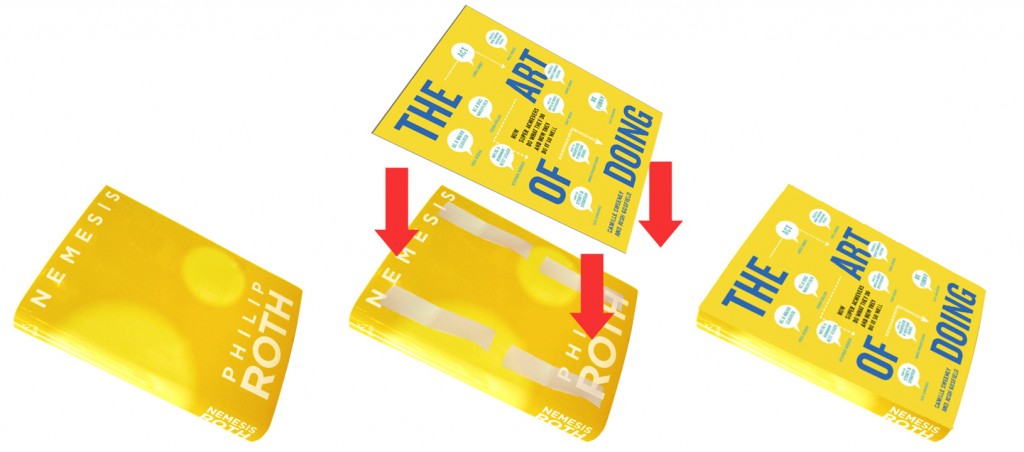
Bill Gross, the brilliant founder of the Technology Incubator Idealab which has started 100 companies (we interviewed him for our book on How to Start a Startup) was adamant about testing a product or service before going to market. Not in a focus group but in an environment as close as possible to the real thing. Testing his theory of testing, we searched for a same-sized book with a yellow cover and found Philip Roth’s Nemesis was a perfect fit. So we printed out our cover, taped it to Roth’s Nemesis, and set out for Barnes & Noble.
 We wandered the store, mock-up book in hand, trying not to draw the attention of B&N employees and guards. We had whispered discussions about which customers to approach, only to have our potential targets leave the floor before we’d worked up our courage. Finally Camille approached a young woman and asked: Would you buy this book? The target was a French tourist who barely spoke English. But we’d broken the ice and approached others. Younger shoppers seemed to get the book. Older ones complained about the small type size and couldn’t fathom what the book was about. One guy with Fifty Shades of Grey tucked under his arm, peered closely at the cover, and nodded, “I’m in.” He’d try anything he said.
Knowing that our power with the publisher was limited, and basically liking the design, we requested only a few discrete changes, larger type size, text revisions for clarity and an added “many more” line to let people know they’d get their money’s worth.
And here’s what we got. A face we can actually love.
Chip Kidd says,
“Book designers responsibility is three fold. To the reader, to the publisher and most of all to the author. I want you [the reader] to look at the author’s book and say, ‘Wow, I need to read that.’”
We hope potential readers feel the same.
If you’re a fan of book covers, here are enough links to waste an afternoon or two: making of a cover in two minutes, vintage covers, more vintage covers, Penguin and Pelican covers, sleazy covers, pulp covers, more pulp covers, old paperbacks, French covers, Latvian covers, all kinds of covers, NYPL archive, blog, and another blog.


