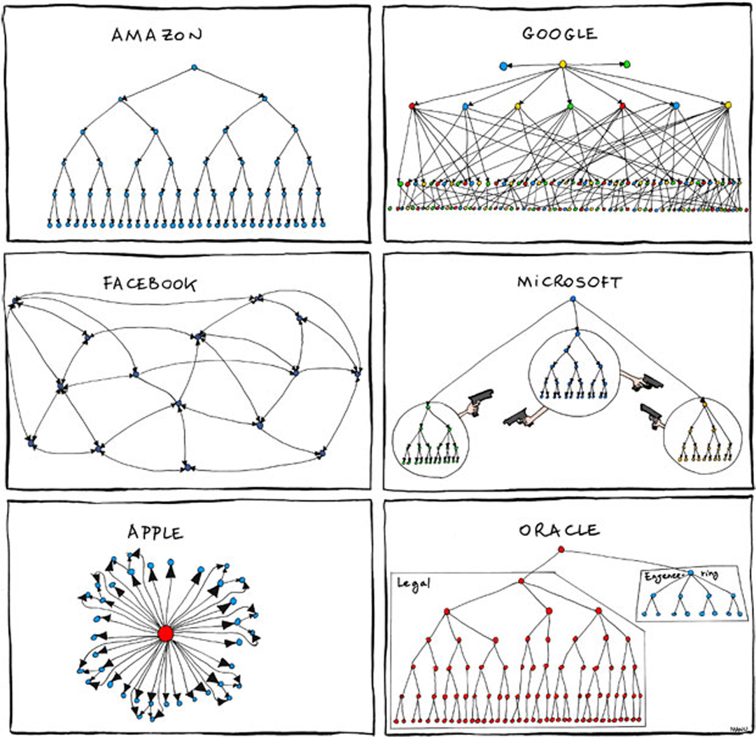
THE SATIRICAL SET OF DIAGRAMS THAT ILLUSTRATED THE LEAD BUSINESS SECTION STORY IN THE NEW YORK TIMES LAST FRIDAY WAS THE WORK OF A FRENCH SOFTWARE ENGINEER AT GOOGLE WHO “DOODLES” IN HIS OFF HOURS.
We were curious about what led Manu Cornet, who works on Google’s Gmail, to create this set of six company culture diagrams that made its way around the Web back in 2011 before resurfacing last week as New York Times art work. How, we wondered, did Cornet come to envision Apple’s corporate structure as a pinwheel and Microsoft’s as a show down at the OK Corral?
So we asked him. And he said:
“I always keep a long list of illustration ideas though I don’t have much time to draw them. I must have been thinking about one of those company’s structures and thinking how Apple with Steve Jobs (before he passed away) must really be centralized to allow him to pretty much have the final word on all matters. So I started imagining a circular structure with Jobs at the center.”
From there, Cornet wondered: What would other companies’ cultures look like? Continue reading “The Google Doodler”